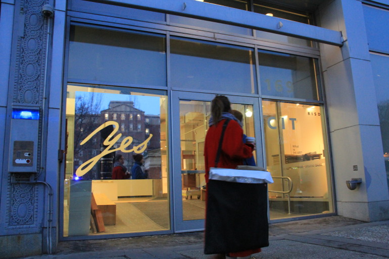
Yes, a typographic intervention
June 12, 2015
Yes, 2014
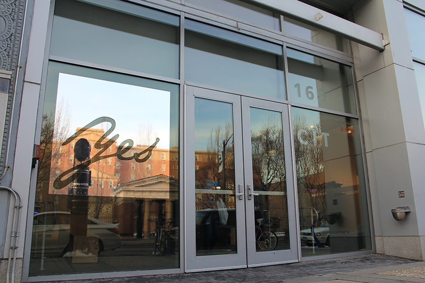
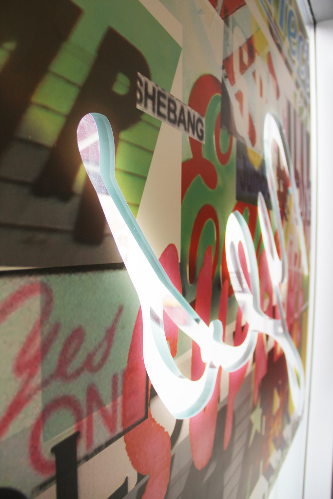
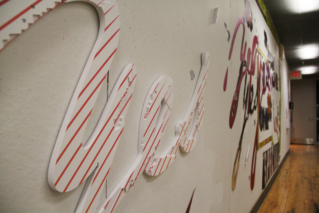
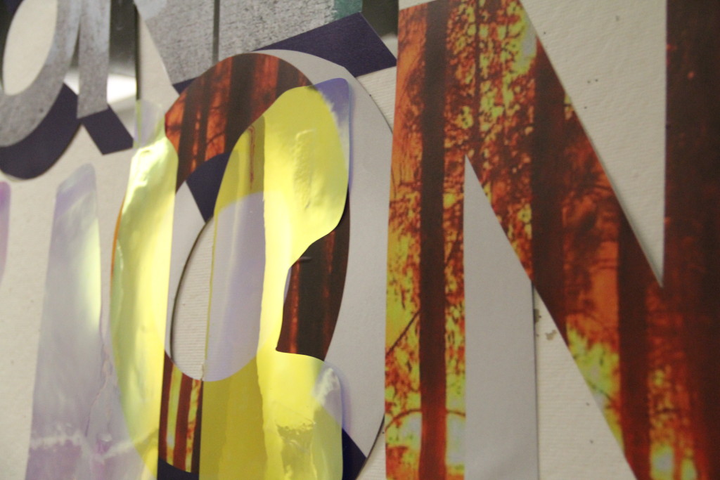
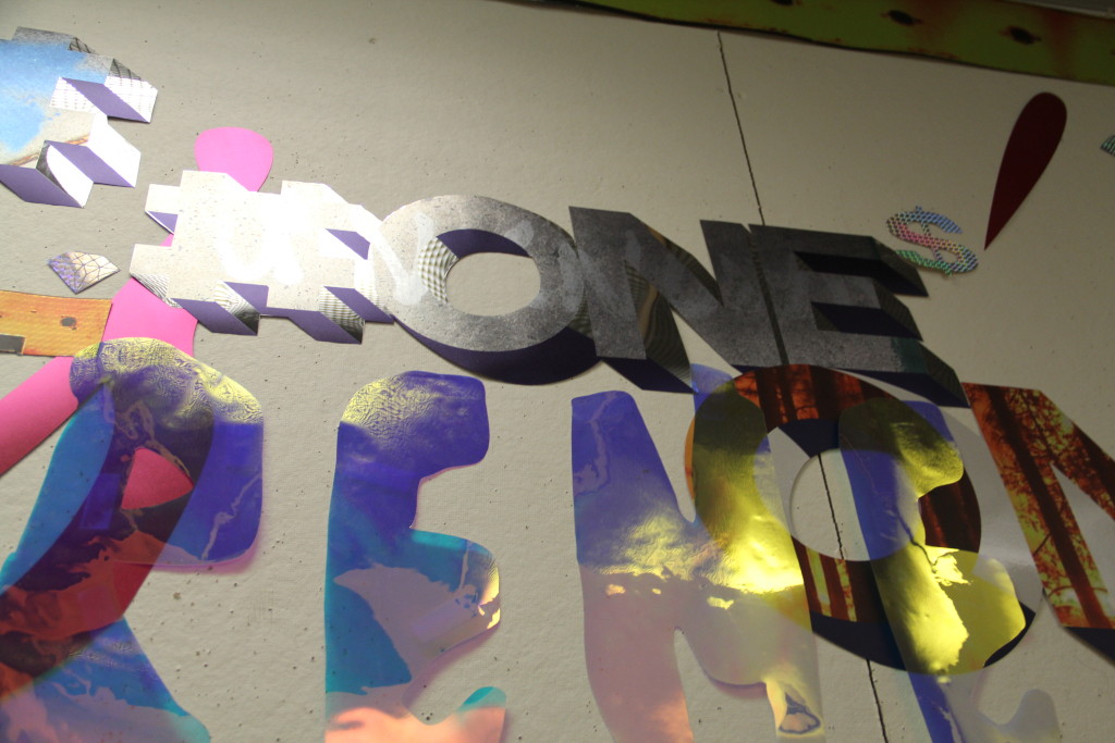
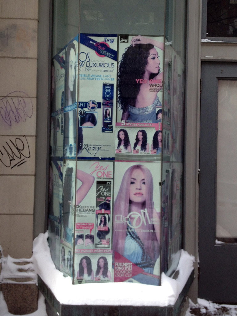
Yes/ type intervention is a form and material research with a focus on letterforms and emblems found in the vernacular signage of Providence’s struggling commerce. The result is a series of environmental installations that emphasize the energetically positive, boosting language of commercial signage, stripping the product from the message so it is only emphatic and earnest. The shiniest, most dazzling signage materials are used, and photographs representing the struggles of the American economy are embedded within the shiny surface, such as “For Lease” in a broken window and public works street markings related to exclusive development, filling some of the letterforms. A line is crossed as the signage transposes these messages from one site to another. The original location has a certain overlooked, low value. The new sites are spaces that represent ideals through pristine presentation or aspiring trendy boutique vernacular.
This research is partly inspired by William S. Burrough’s Cut-Up projects, as a “cutting” methodology, a process that looks at language and “control mechanisms.”
As installed on the RISD CIT graduate studies building:
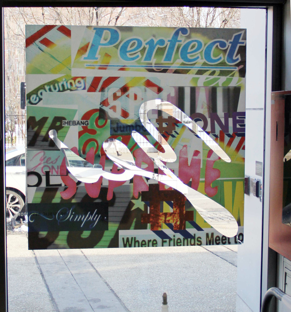
composing another installation with multiple materials: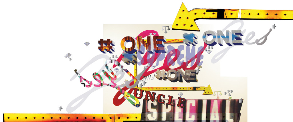
one of the origins of the found type, a storefront around the corner from a RISD building in downtown Providence:
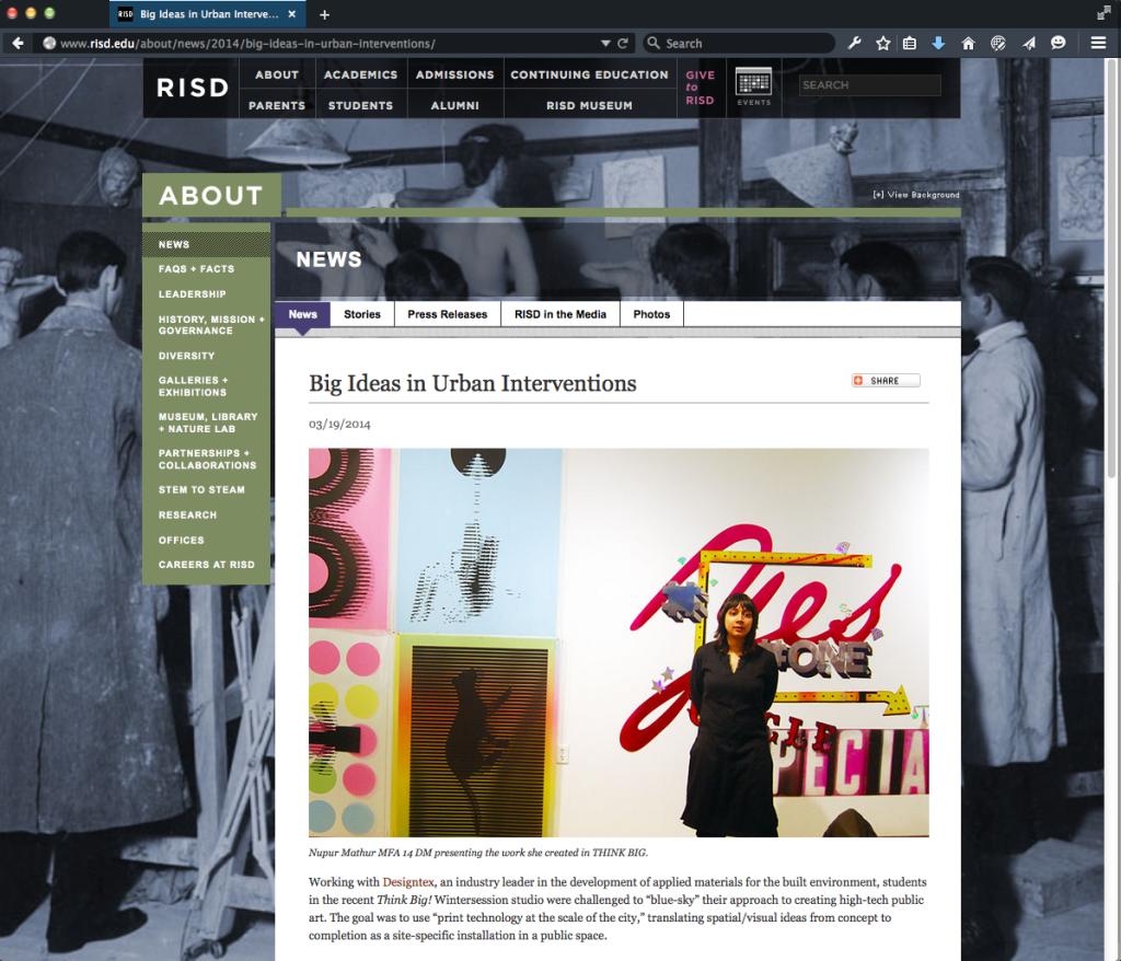
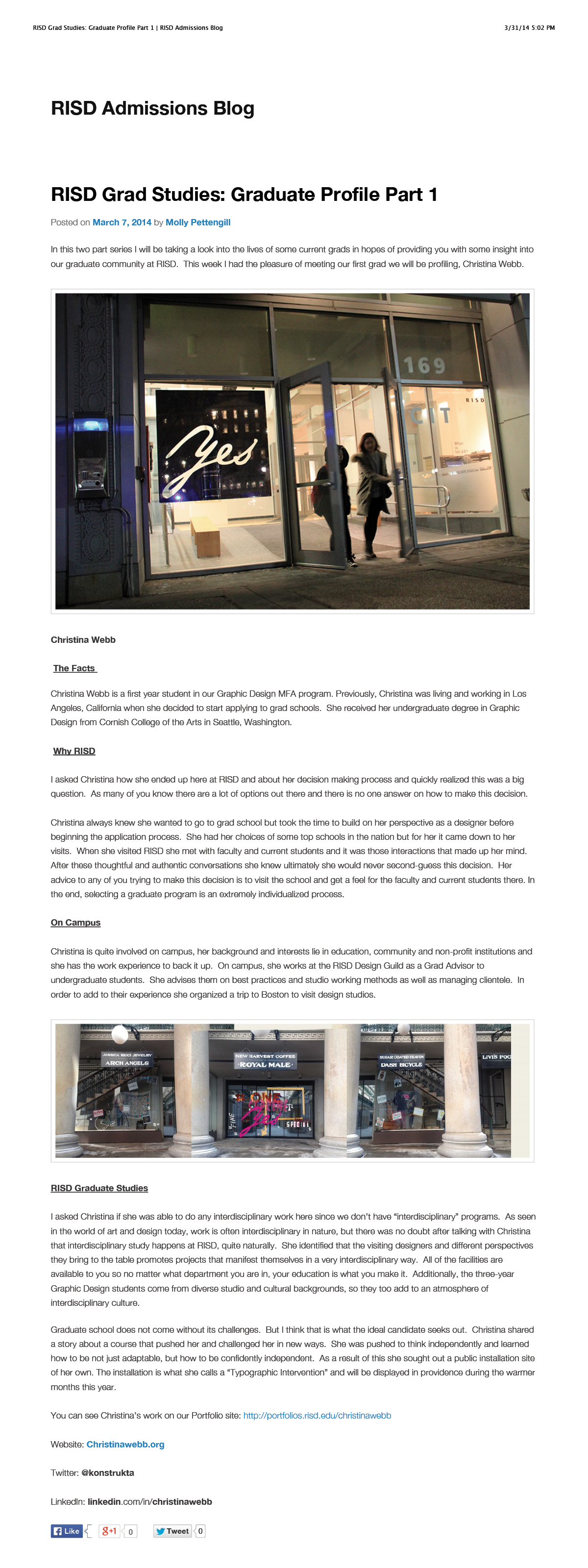
write-ups:
© 2026 Christina Webb
